The Project
Lana Meadows, a veteran wedding planner serving Southern California, wanted to update her five-year-old website. Her competition in recent years have launched more sophisticated websites, and wanted a customized websites that would attract potential customers in this competitive industry.
Lana Meadows, a veteran wedding planner serving Southern California, wanted to update her five-year-old website. Her competition in recent years have launched more sophisticated websites, and wanted a customized websites that would attract potential customers in this competitive industry.
The Challenge
Her website just wasn’t attracting customers.
Lana Meadows wanted to target potential web users and convert them into paying customers.
The old website, which had been fairly static for years, had a poor search engine ranking, and she wasn’t sure if the content was appealing to potential customers and leading them to contact her.
The Solution
Over and over again, brides told me that the most important criteria for choosing a planner was they had to feel a comfortable and have a personal connection. When they met her for consultations, they decided to hire her.
I wanted to simulate this sense of trust and personality on the site, so it would encourage users to take the next step and contact Lana.
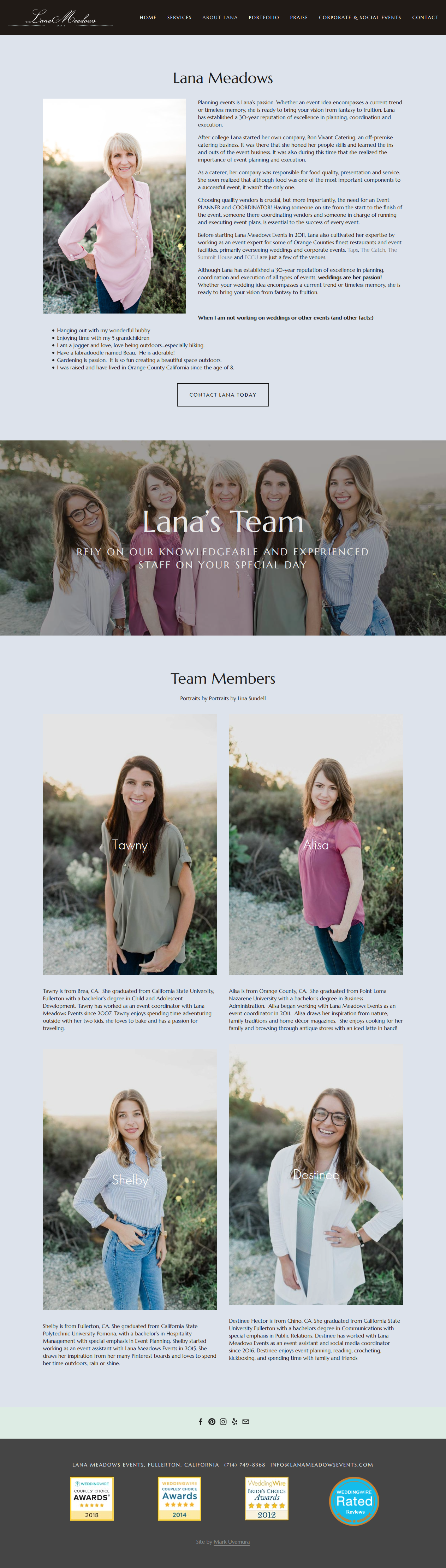
We decided to put a large emphasis on Lana’s personality, experience and skill set on the website. We also decided to display her reviews and testimonials that past clients talk about what a great experience they had. •
Research
We needed to figure out about the user. Since we didn’t have any past analytic traffic data to start with, we floated an online survey to gauge
Online Survey
I quickly created an online survey in Google Forms, and sent it out to a list of potential, current and former clients. I wanted to gather demographic information and get a feel on their most important wedding planning needs.
86%: Vast majority of wedding planner clients are female.
31: Brides are an average of 31-years-old.
30%: Use a smartphone to search for wedding planners.
#1: Personal connection as the most important criteria for choosing a planner.
Competitive Analysis
I analyzed four competitor wedding planning websites with Lana Meadows Events. I scored each website on 10 heuristic criteria and features that were common on other wedding planner websites. Lana’s website came in second out of five, scoring 20 out of a possible 30 points.
We uncovered some missing features that would allow Lana to surpass her competition. She scored high in browsing, navigation and clear use of language, and identified that she had work to do on the About Me and Planning Process topics.
Interviews
In-depth data was gathered with interviews with four brides that participated in the online survey. The questions identified goals, motivations and frustrations with the wedding planning process and website.
User Insights Report
After compiling the research, I analyzed the data to come up with one user type and came up with seven user insights.
Lana has a great reputation and turns that into business.
Lana’s online presence helps with conversion from users to customers, but is not the starting point for many potential customer.
There’s one dominate type of customer: The Bride.
Brides are technically savvy.
Brides weren’t aware of the amount of detailed planning and coordination– and the COST.
Brides are looking for packages to get their bearings
The existing website is nicely designed, but is lacking in some key features when compared to competitors
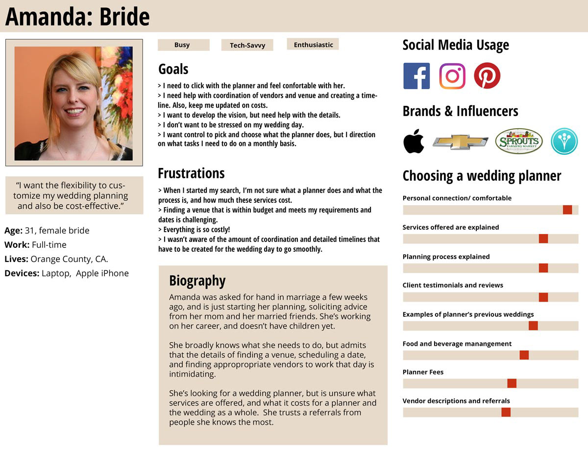
Persona
Using the User Insights Report, I created a fictional character that represents the target user.
New features
With our persona in hand, the stakeholder and I brainstormed ideas on what would help Amanda reach her goals, help solve her frustrations and offer what’s she’s looking for in her wedding planner.
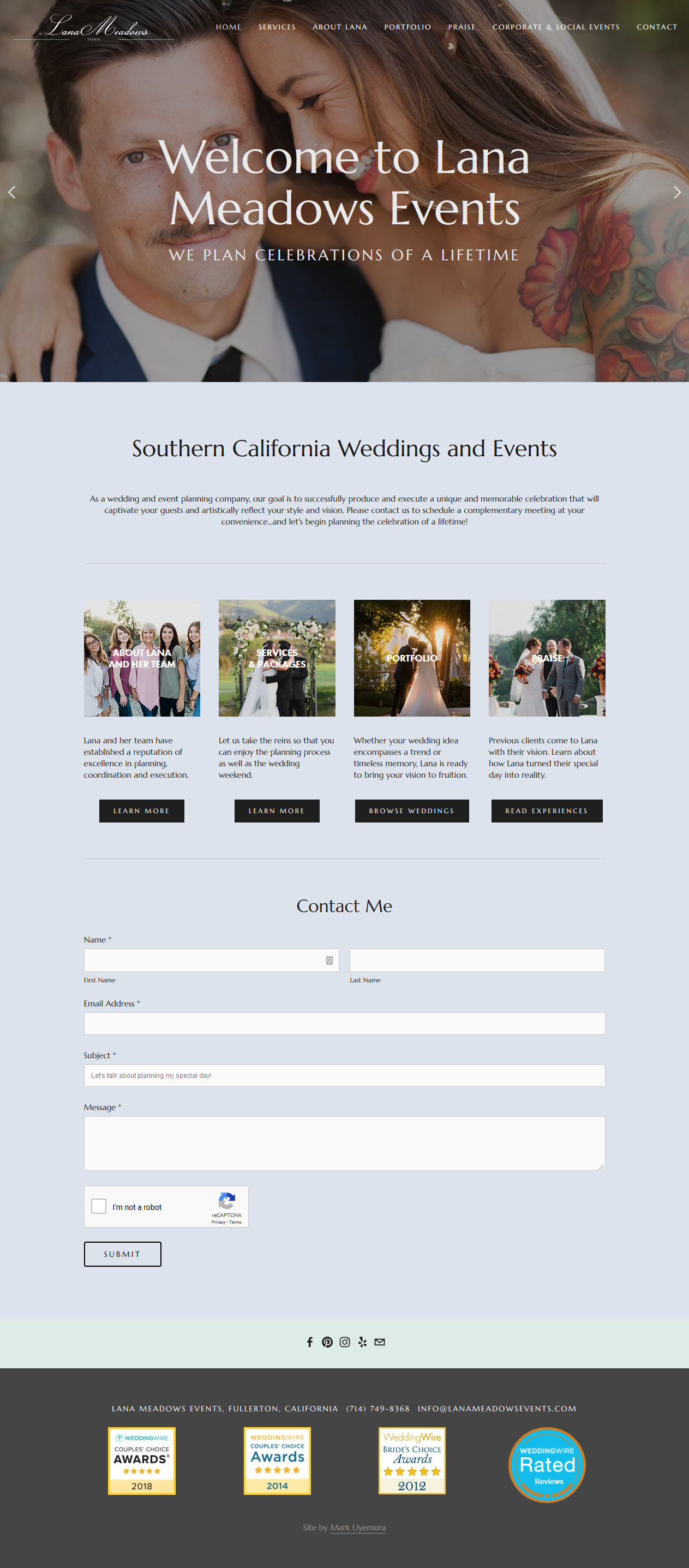
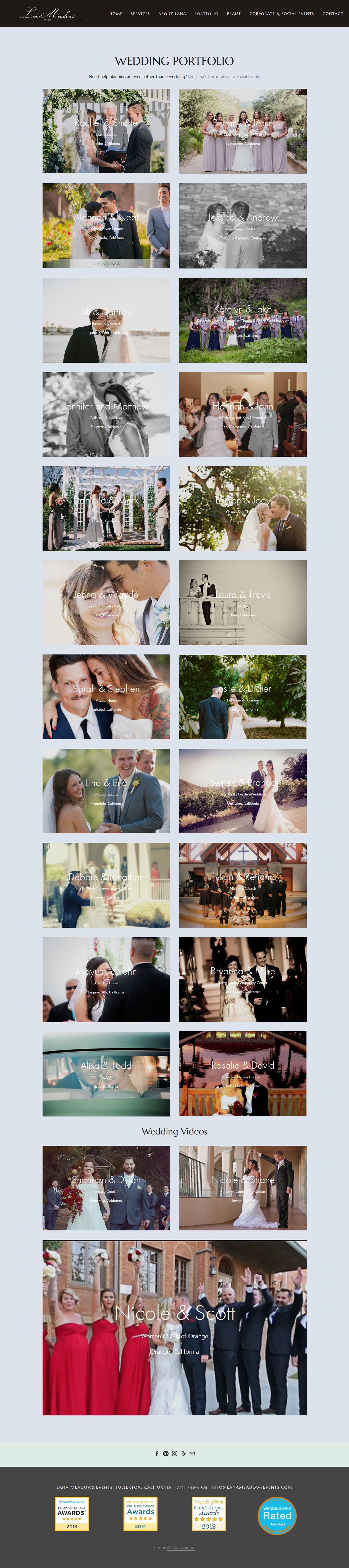
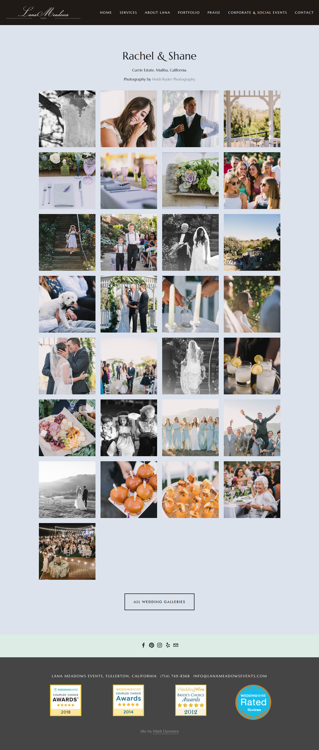
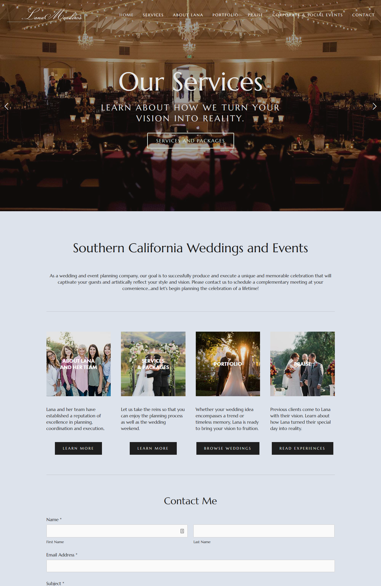
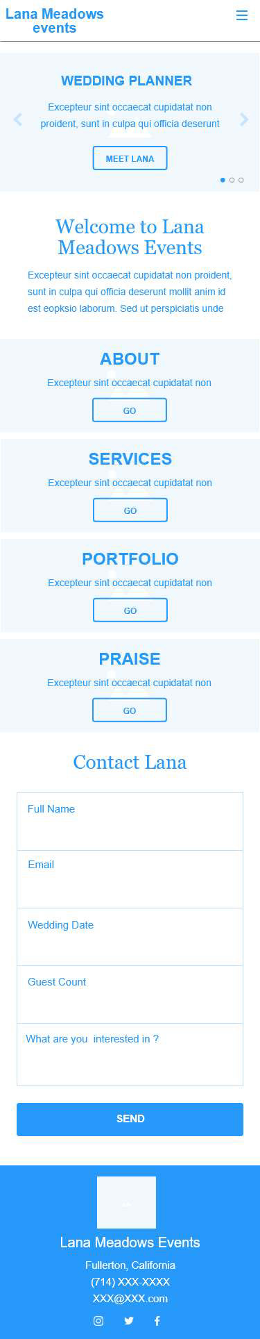
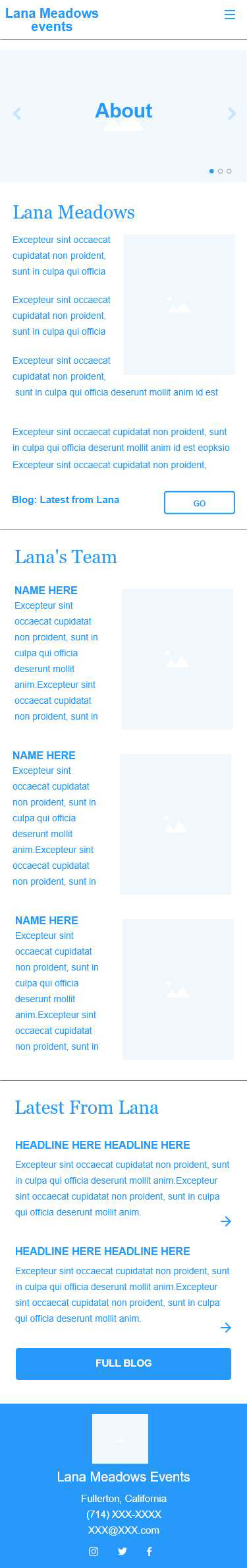
We wanted to emphasize Lana’s story to recreate the comfort that is created when they meet her on the initial meeting. This would encourage a Call-To-Action and make contact via E-mail form or phone.
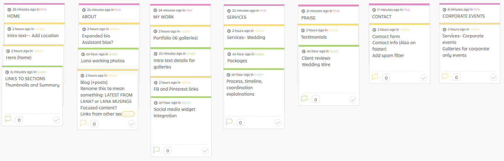
Site Map
I created organized old and new features into groupings and create a site map. I incorporated feedback from the stakeholder.
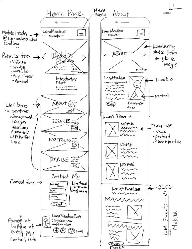
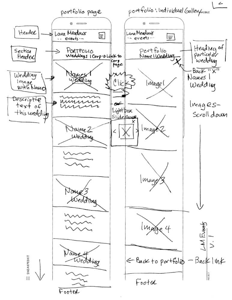
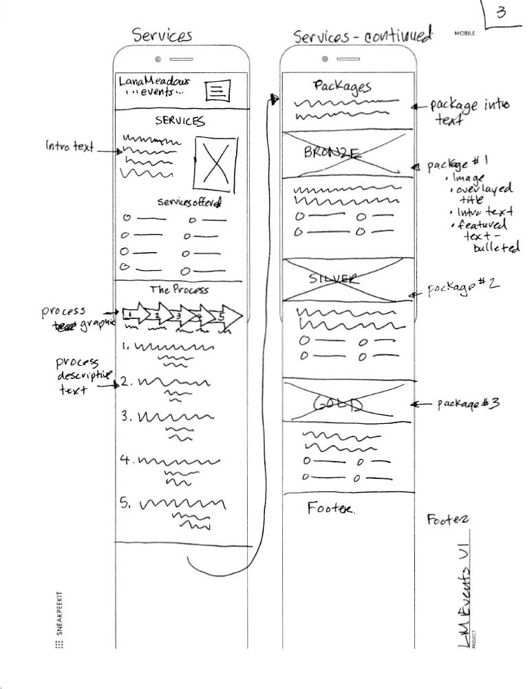
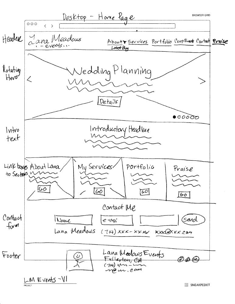
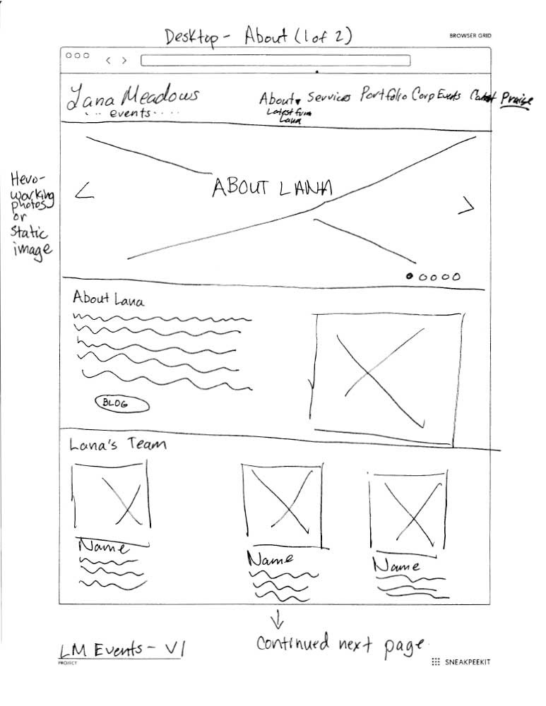
Sketches
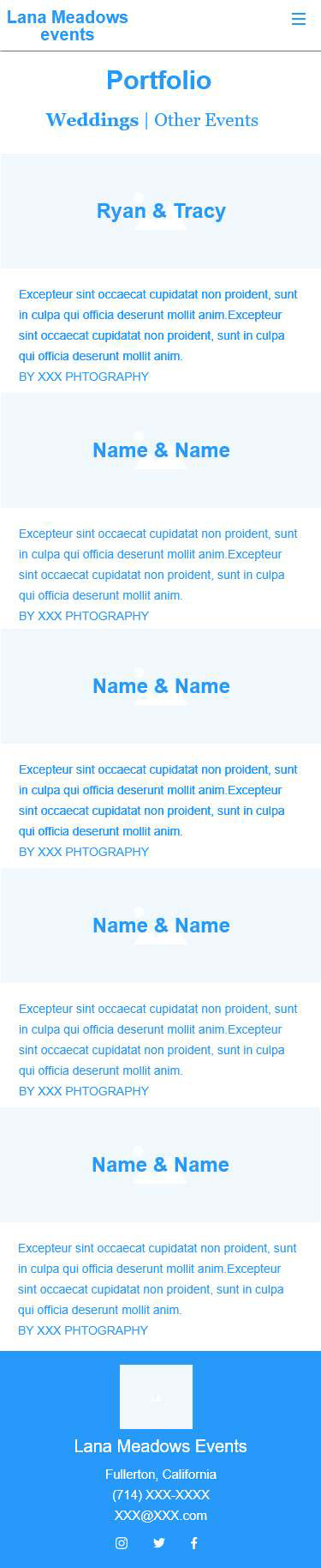
With the underlying foundation of satisfying our persona Amanda, combined with the feature list and site map, I started screens on pen and paper. Our most important attribute was focused on making new users comfortable and aware of Lana’s experience and personality– which was incorporated on the hero images and a new category.
Mobile screens were done first, and then I sketched a responsive desktop version.
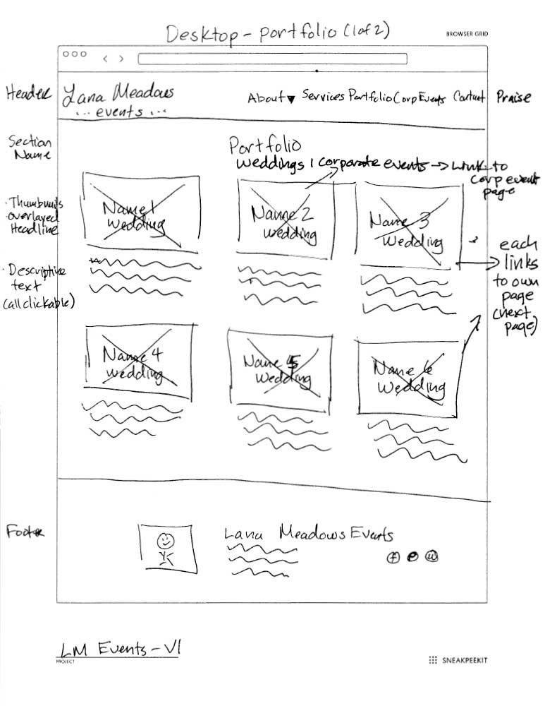
Wireframes
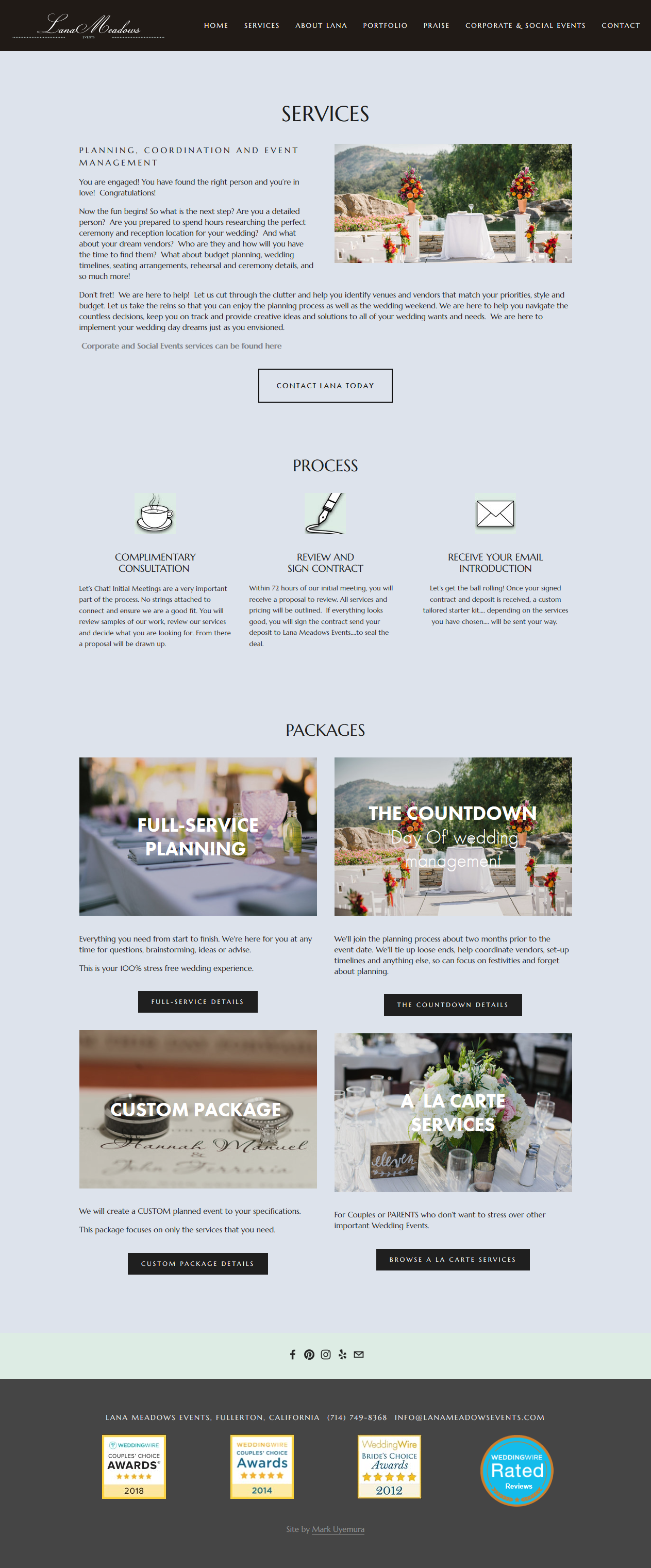
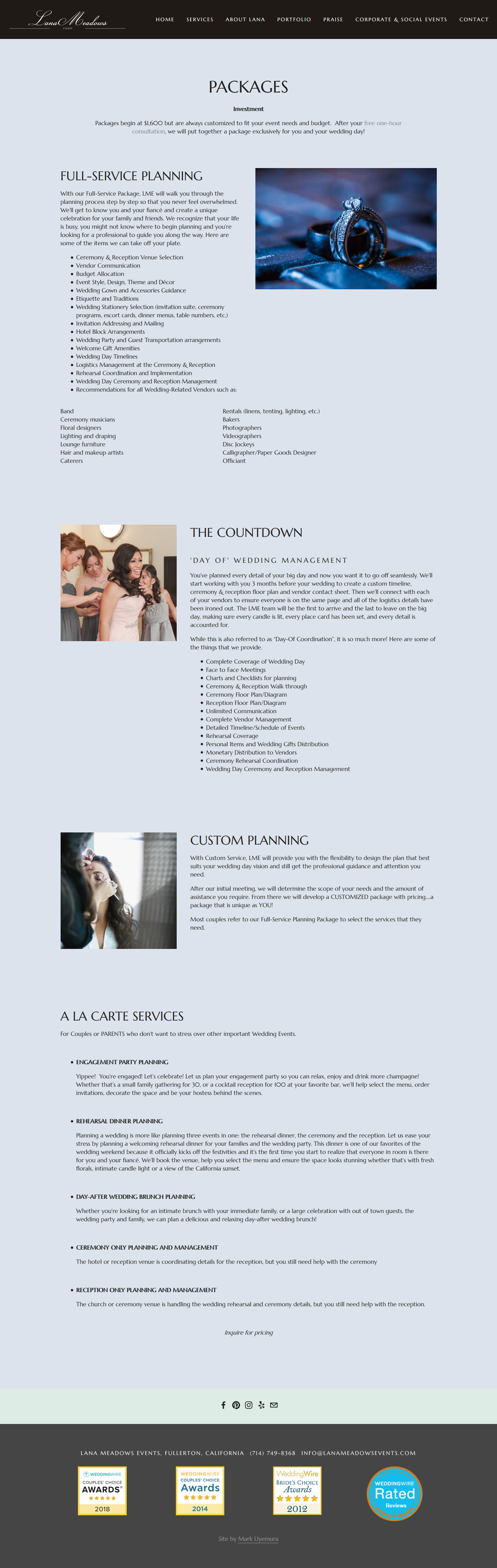
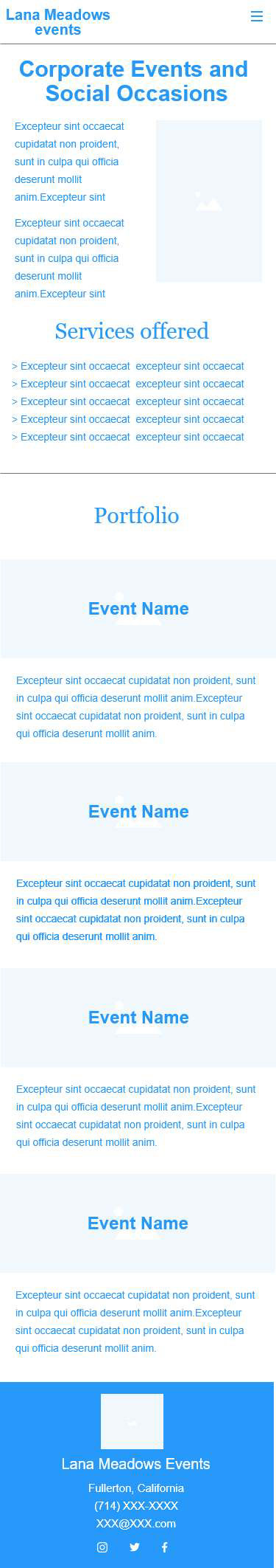
After a meeting with the stakeholder, the sketches were updated with changes. We discussed changes in how to present content, particularly the presentation of the three wedding planning packages. I had to to make it easier on our users on what services each package included.
I proceeded to create more formalized wireframes in Adobe XD.


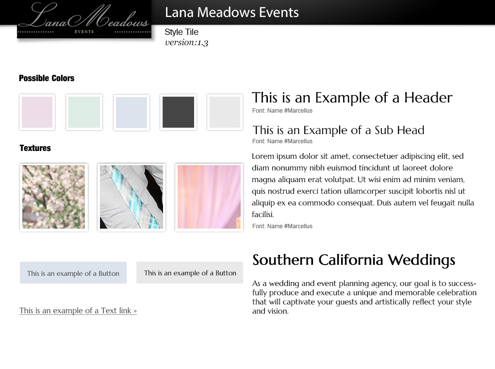
Styles
The client and I went through two versions of color schemes and font styles. We finalized on a soft pastel color palette and Marcellus typeface to appeal to modern brides.
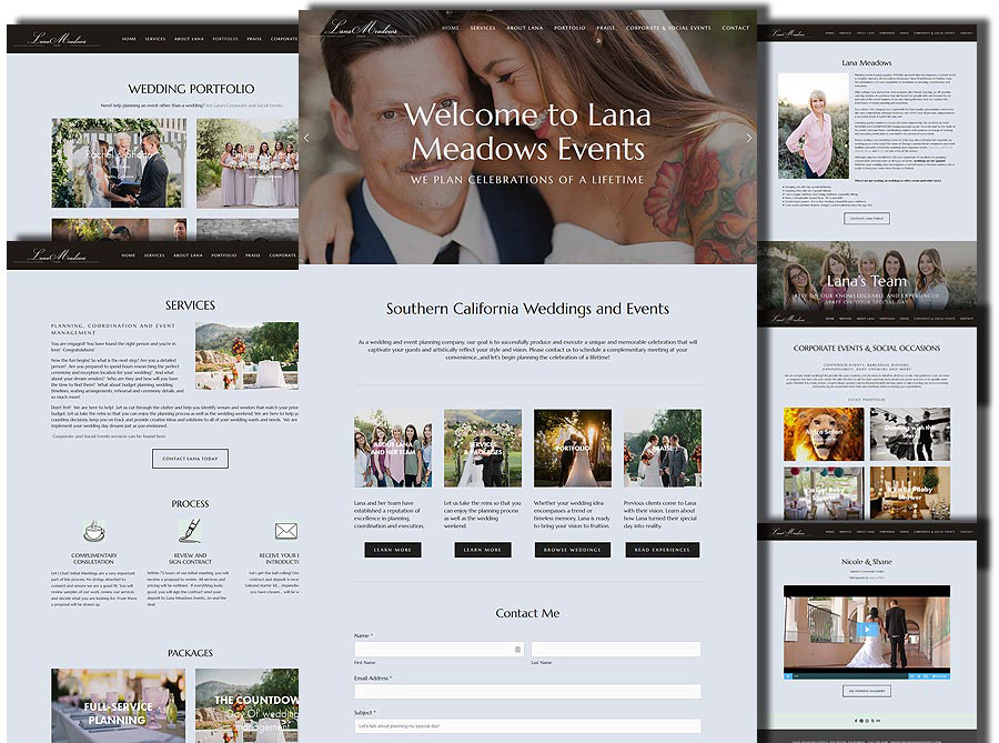
Implementation
From the beginning of the project, the client had expressed frustration and fear about maintaining her previous website. “I don’t want to learn this stuff over again every time I want to update the site, and I think I’ll break something,” the client told me a few times throughout the project.
Because of this, she didn’t update the site for long periods of time. We had to solve this problem, since the website was an organic thing that couldn’t stay static and unloved for long.
I researched various hosted vendors, and decided on Squarespace for their sophisticated drag and drop editor. The ease of use was good for the client from a maintenance perspective. The limitations on the templates could be overcome, and the vast majority of UI elements that I had designed could be done with the Squarespace editor.
We moved her site from WordPress to the new vendor and had to be creative to adapt the wire frames to actual web pages. In the end, they closely matched, and successfully fulfilled our goals to satisfy our persona Amanda and make it easy for the client to update.