The Challenge
A monthly printed bulletin was the only means of communication to inform members, and many were missing numerous club activities and services.
With the lack of updated with relevant information, members didn’t know there was a website, and many knew of it, but didn’t feel it met their needs.
The website became an afterthought, unloved by the club staff and unused by residents.
The Solution
The new website would be focused on informing residents and driving participation.
• It would drive more users and encourage repeat visits to the website (and ultimately the club) with updated, timely and relevant content and an e-mail newsletter.
• Organize content into a logical hierarchy with easy to use navigation and search.
• Create a user interfaces that reflects Glenbrook’s values.
• Website must be mobile, tablet- and desktop-friendly.
Research
First I needed to find out if the old website for the Brea Glenbrook Club was meeting the needs of the residents it serves. I designed, conducted and analyzed data from an online survey and one-on-one interviews.
Online Survey
An online survey was implemented on Google Forms and sent out to residents on club e-mail lists and posted on NextDoor.com. 49 residents responded to a set of questions asking about the composition of household, how they learned about club activities, level of participation, computer and mobile usage, website awareness and usage, and their opinion on new website features. View the online survey
Interviews
Five users and two club staffers where chosen to do in-depth interviews to unearth what particular pain points and needs they had. I analyzed the data from the survey and interviews and unearthed some insights. Read Interview Guide
56% Don’t use the current website
58% Think there could be improvements made to to the website.
64% Would use a mobile version of the website on their smart phone.
98% Are interested in club activities.
Insights from surveys and interviews
Most of the residents use the club at least once a year, but many don’t get their information from the club’s website. Why is this?
Different stages of residents lives affect their interest levels in current club activities and use of the website. Other contributing factors include awareness, lack of information, use of technology, and duplication of the printed club newsletters.
Many residents don’t use the web site, and many weren’t aware of the Brea Glenbrook Club web site
Majority of respondents think there’s room for improvement
They are looking for activities for their children or grandchildren.
They had difficulty finding events, as the site isn’t updated enough to be useful.
Many mentioned that the design made it difficult to find information, particularly how sections were labeled and that the design looked outdated.
Heuristic Review
I analyzed HOA websites through recognized usability principles to ultimately improve the user interface and experience. I’ve evaluated four HOA websites using Jakob Nielsen’s 10 criteria. Detailed heuristic data can be found here and the one-page analysis can be read here.
Only one of the four websites earned a passing grade, and the Glenbrook website got an F. Why the bad grade?
Confusing navigation, bad accessibility on mobile devices, and information hidden inside PDF files.
PERSONA AND EMPATHY MAPS
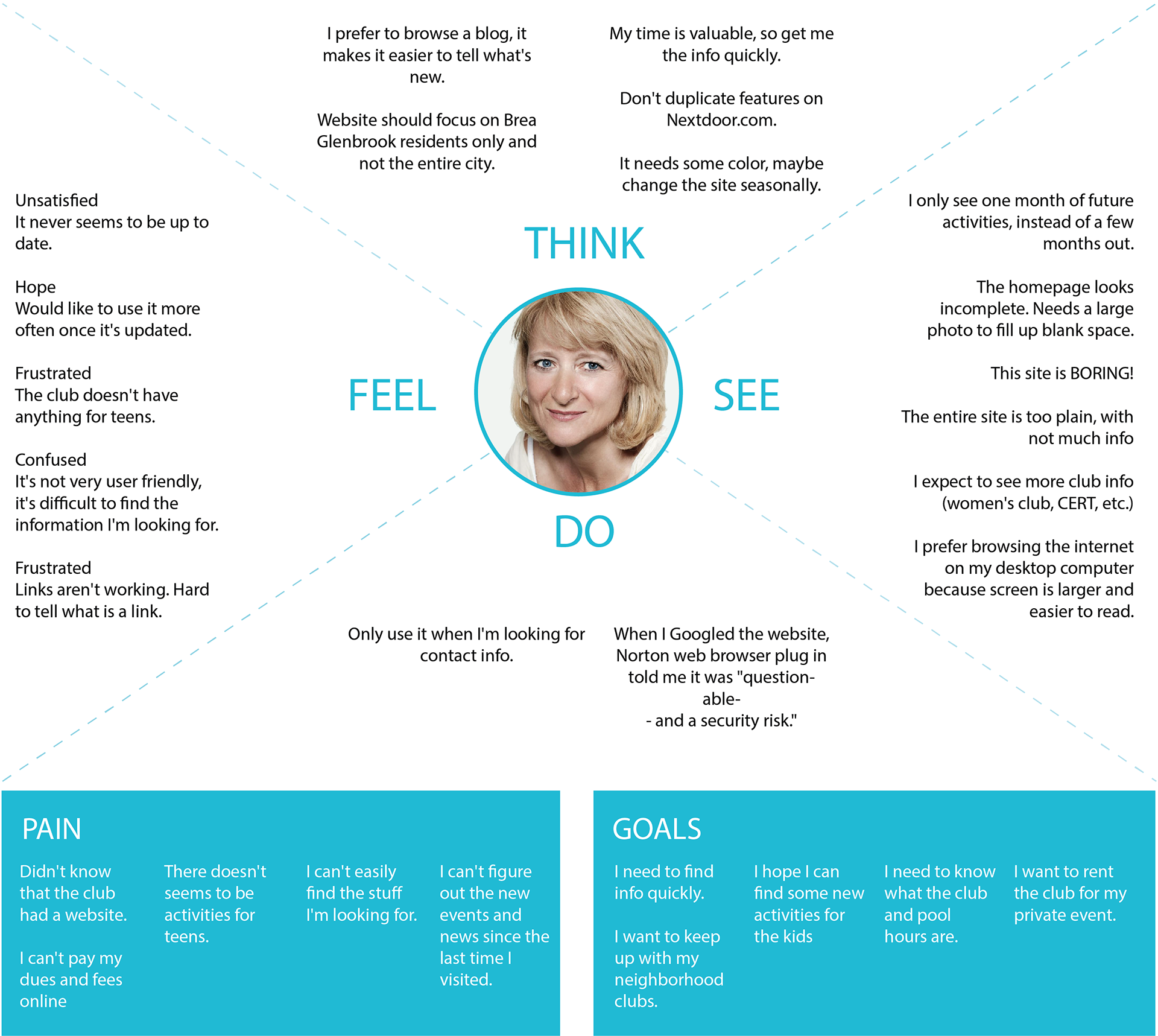
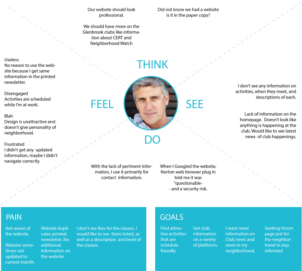
To help focus on designing a product that would be useful to residents, personas and empathy maps were created on the basis of people interviewed and surveyed. Three customer types emerged.
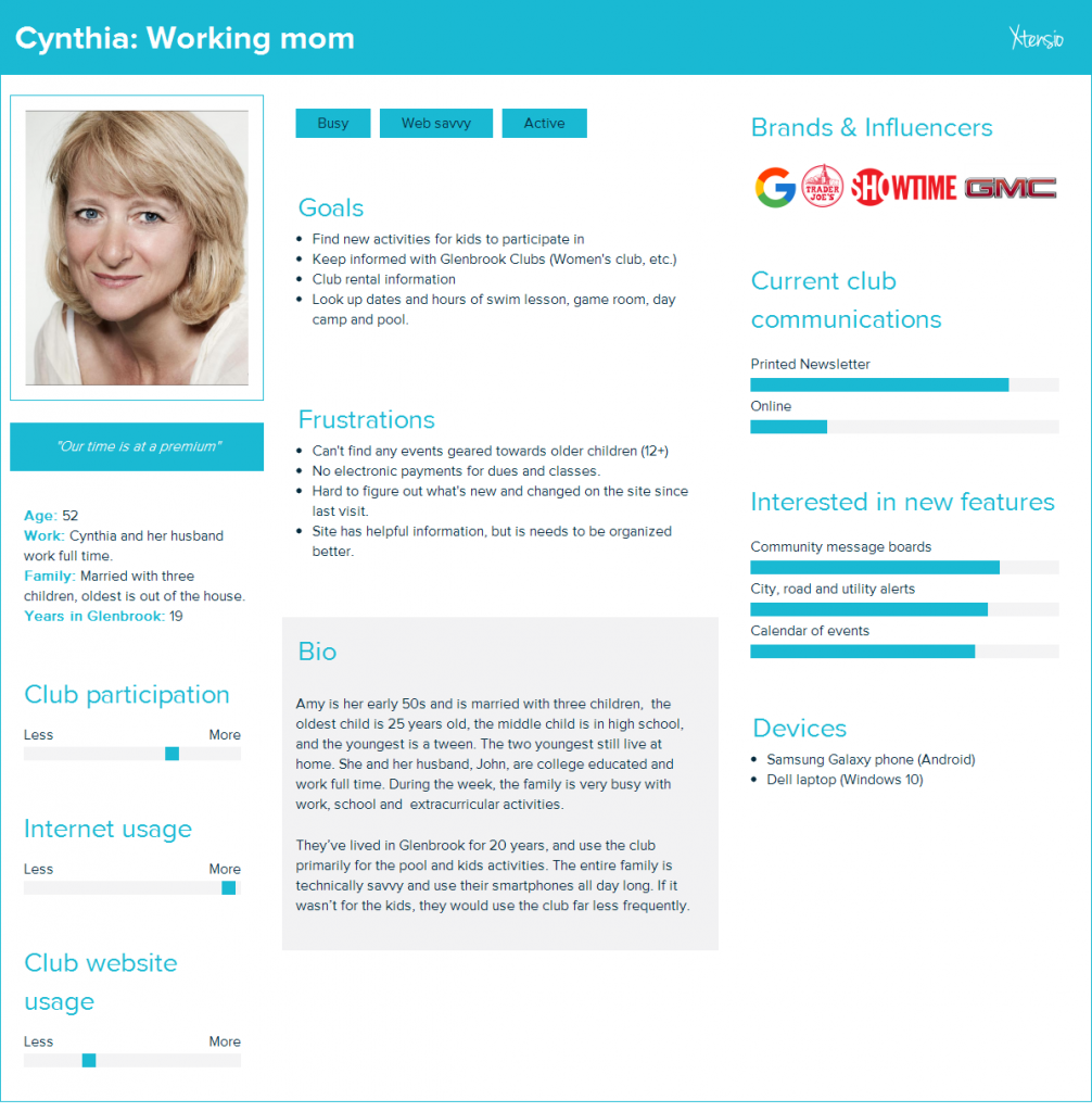
Cynthia, married, working mom with children
Looking for activities for her children
Keep up with the Women’s Club group
Want to rent the clubhouse for my event.
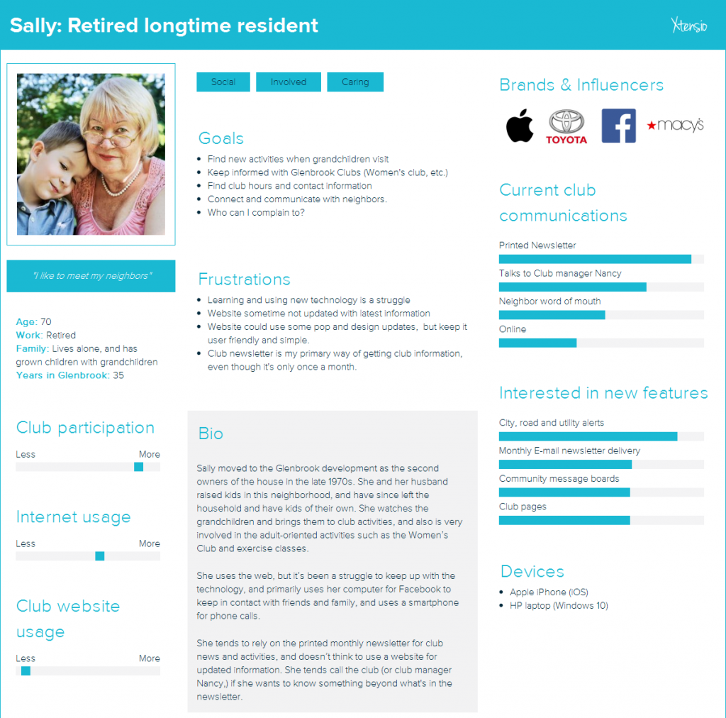
Sally, retired, lives alone, with grown children and grandchildren.
Looking for activities for my grandchildren
Connect with neighbors
Contact information for staff members.
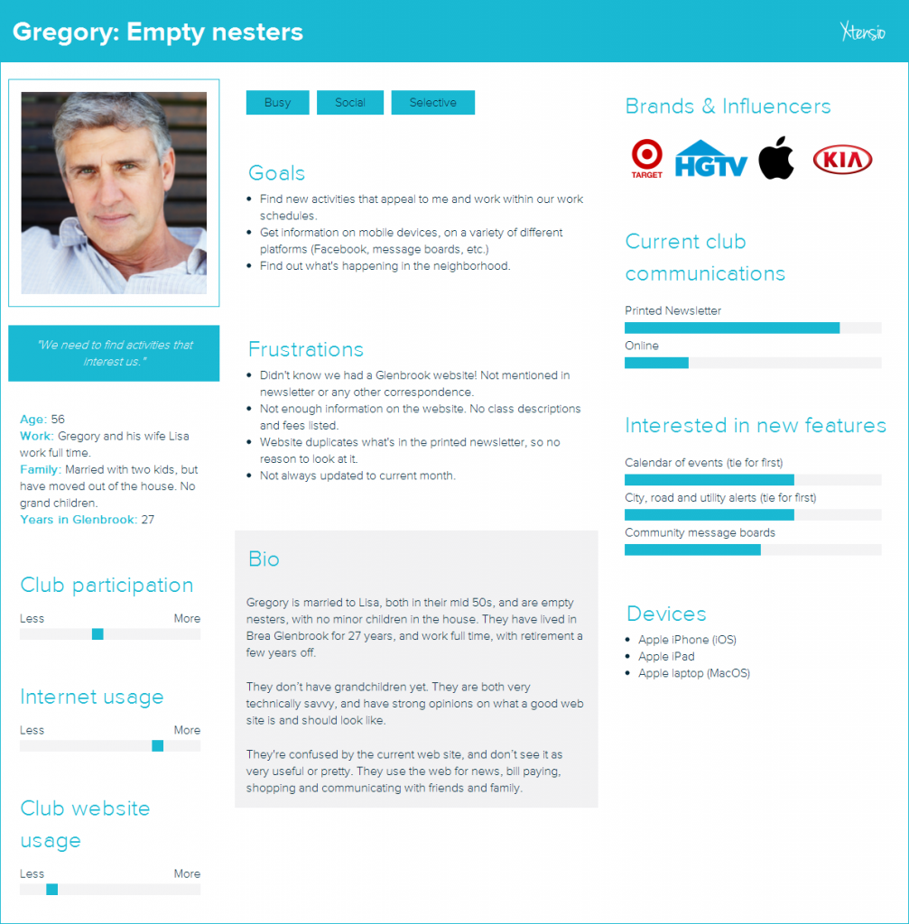
Gregory, married, working with grown children and no grandchildren.
Find activities for adults.
Use my mobile device to browse.
Seeking neighborhood and city news.
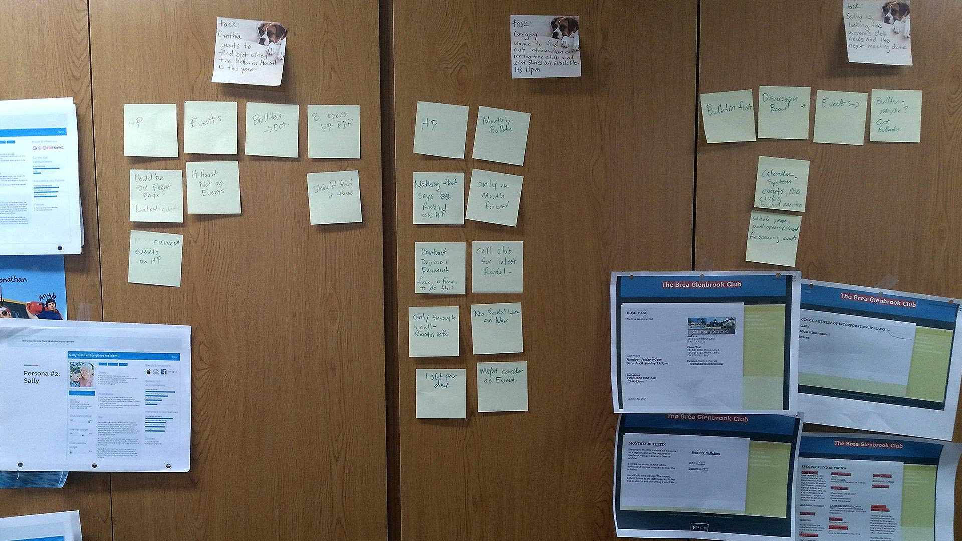
Scenario Map
The goal of the map was to identify pain points and understand behavior on the existing web site through the eyes of our three personas. I led a group of club staffers through a specific task for each persona.
What we learned on the existing Glenbrook Club website:
1. Users couldn’t find the information they were searching for, and was often hidden in the monthly newsletter PDF.
Suggested solution: Bring information out of PDF files and onto regular web pages so they can be more easily found and indexed by search engines.
2. The navigation didn’t help personas and was confusing.
Suggested solution: Card sort content and features and create a logical site map.
3. Some events weren’t listed on the events page.
Suggested solution: Create a master calendar with all events, classes and activities.
4. Personas looked for site search (which didn’t exist,) when they got frustrated looking for particular things.
Suggested solution: Add site search to navigation and header.
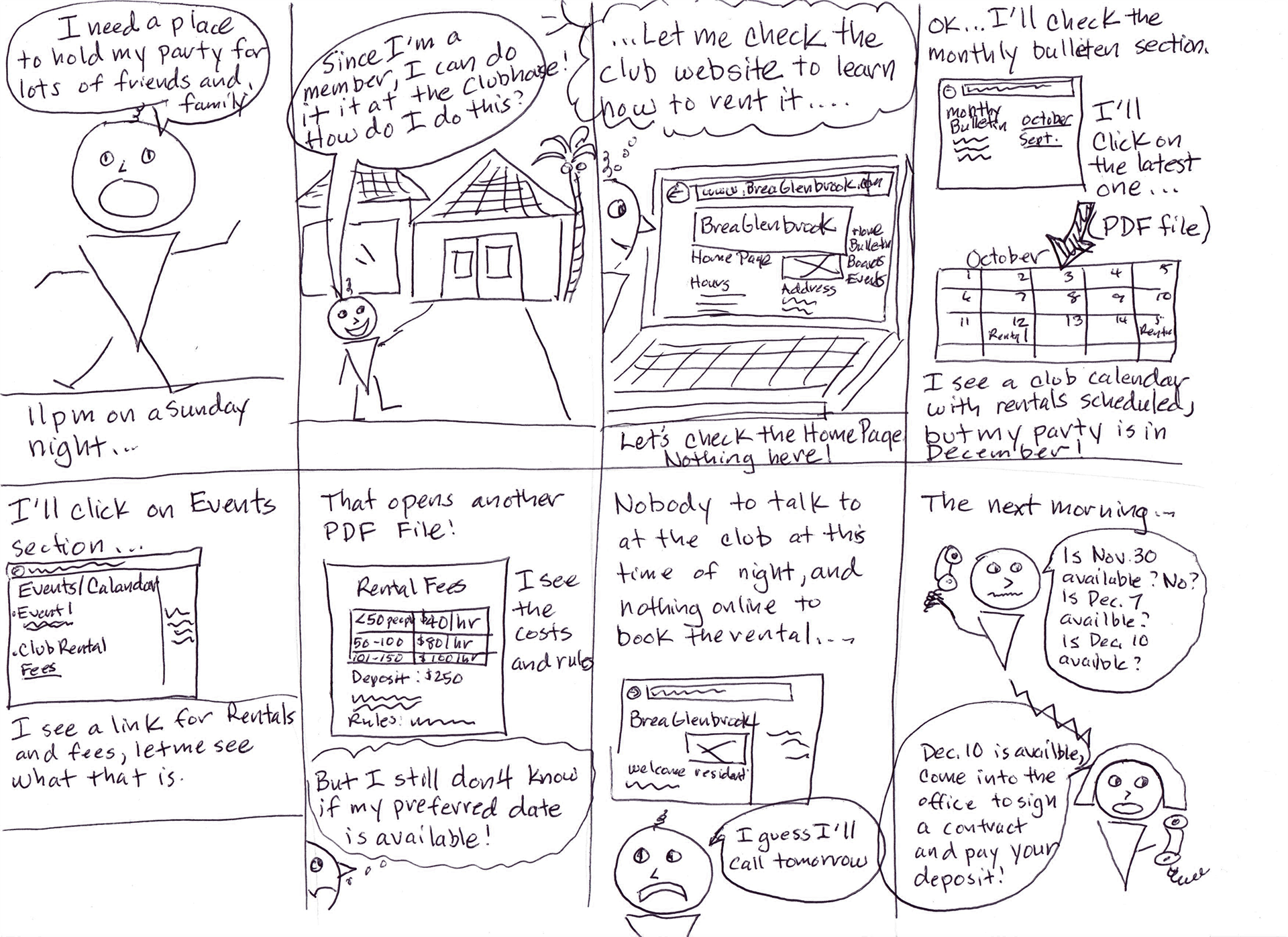
Storyboard
Gregory had multiple pain points in his task to find out how and when to rent the clubhouse for his party.
Navigation needs to be improved for club rentals
An updated and forward-looking calendar with available rental time slots needs to be created.
The fees and rules on renting the club have to come out of the PDF document so they are more easily found.
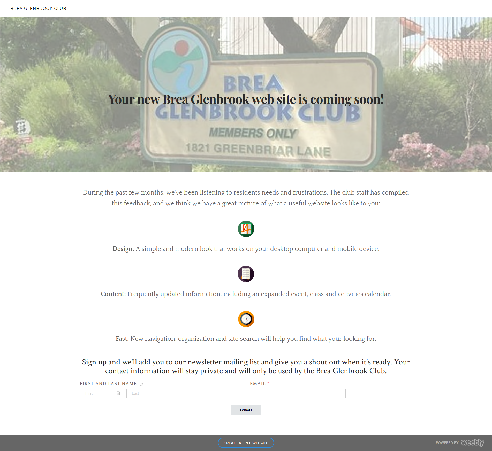
Minimum Viable Product
The persona data led us to ideas for the new and improved club website. I implemented a MVP launch page using Weebly to test viability and interest of this new website. I used a hosted Weebly.com site for speed of implementation and sent out on club mailing e-mail lists and posted on Nextdoor.com for the Imperial and Associated Ave. region. We received 41 responses in one day, with a total of 70 users, and reinforced our ideas for the new website.
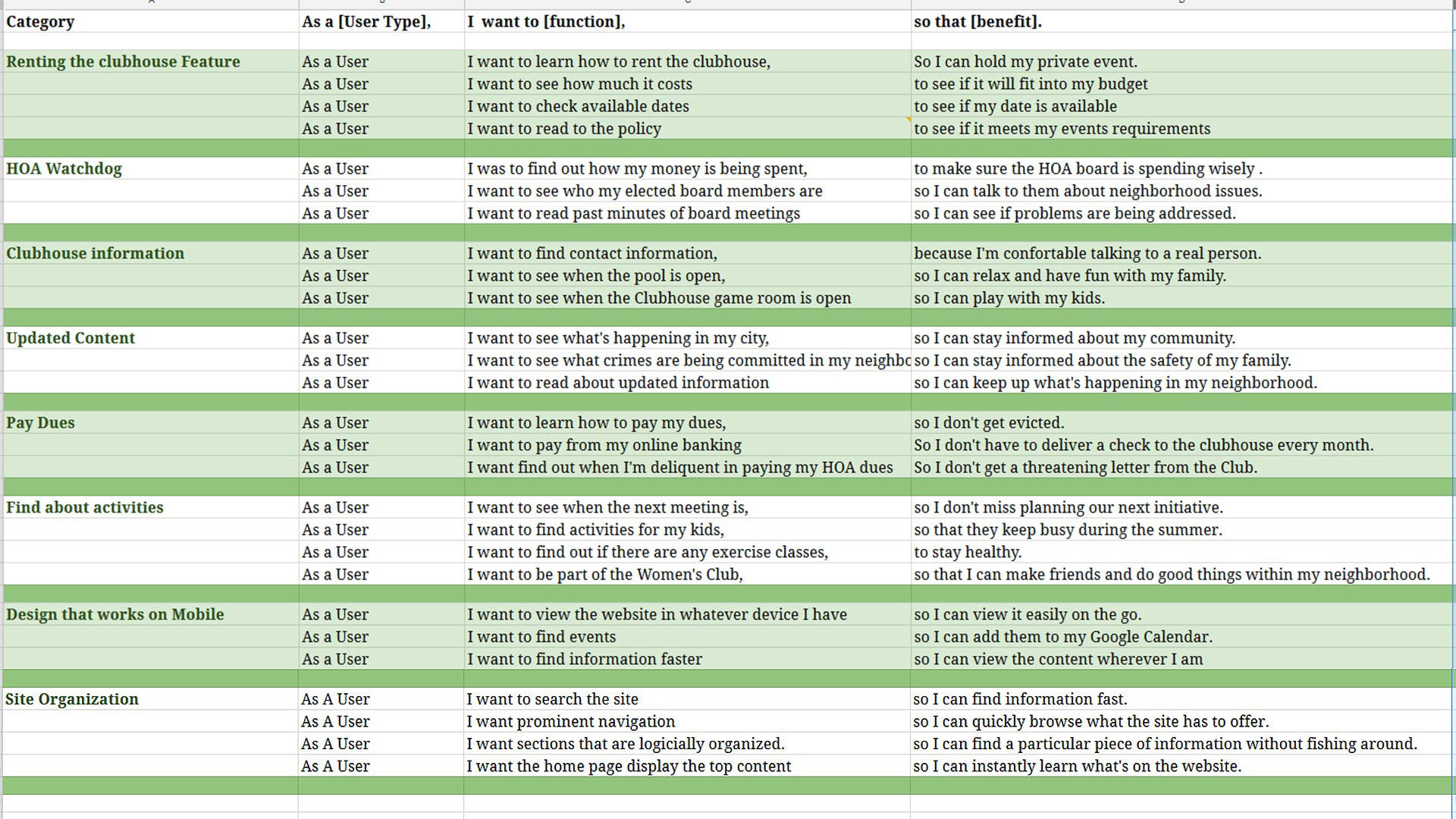
User Stories
I created user stories to keep the product focused, and so the stakeholder, staff and I stayed on the same page and to prevent feature creep.
Some of the more important user stories include:
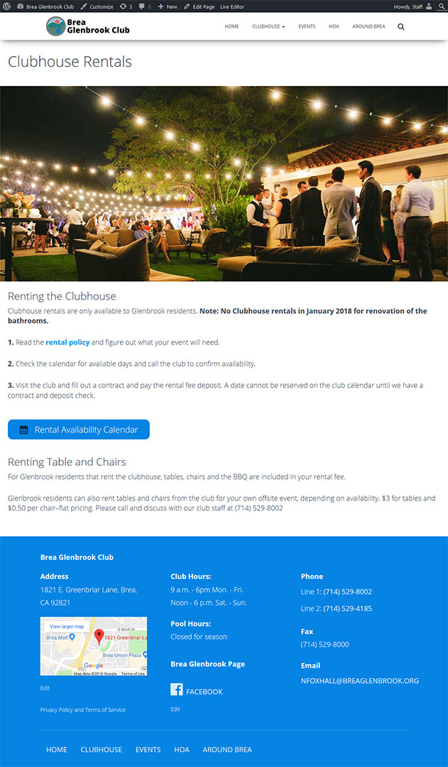
As a User, I want to learn how to rent the clubhouse so I can hold my private event.
As a User, I want to read past minutes of board meetings so I can see if problems are being addressed.
As a User, I want to learn how to pay my dues, so I don’t get evicted.
As a User, I want to find activities for my kids, so that they keep busy during the summer.
As a User, I want to view the website in whatever device I have so I can view it easily on the go.
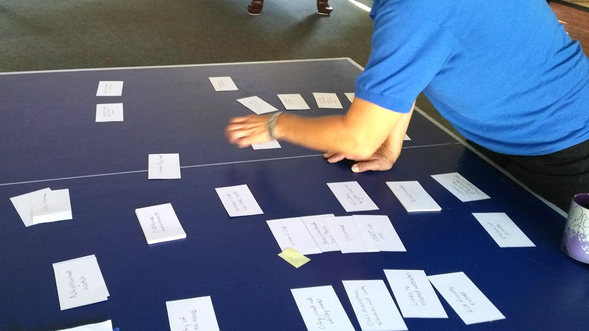
Card Sort
Five users organized content using the open card sort technique using 55- 3X5 index cards. Cards had content and functions on them. All of the users where residents of the neighborhood, and are familiar with club activities.
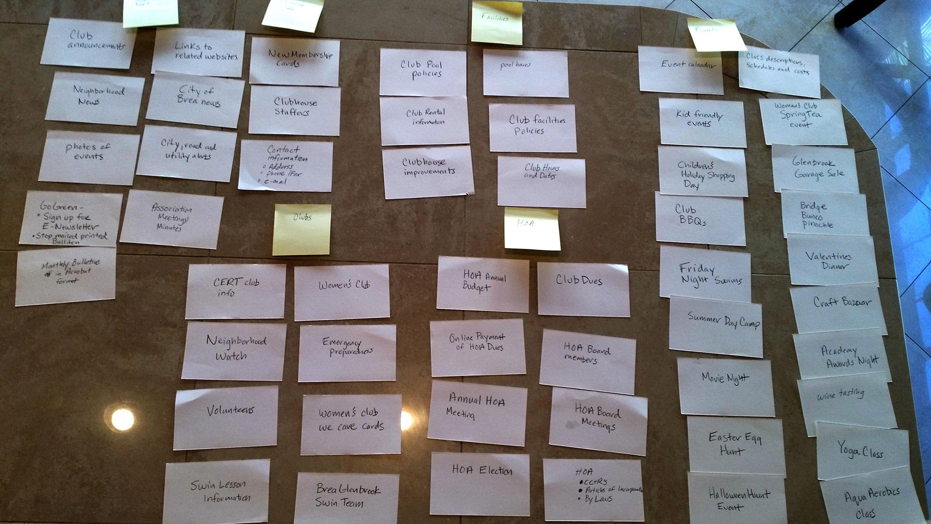
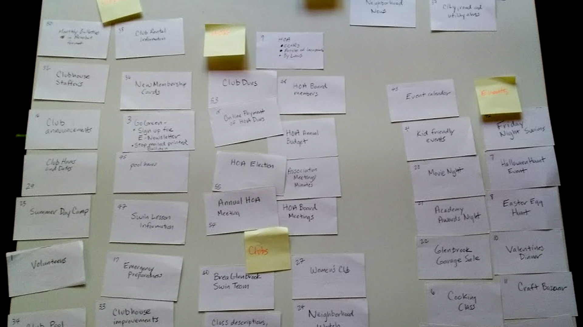
Card Sort – Summary and Findings
I fed the card sort data into an Excel spreadsheet, and organized and standardized groupings and group labels. My analysis, complete with sub categories, can be read here.
Here were the major groupings after analysis:
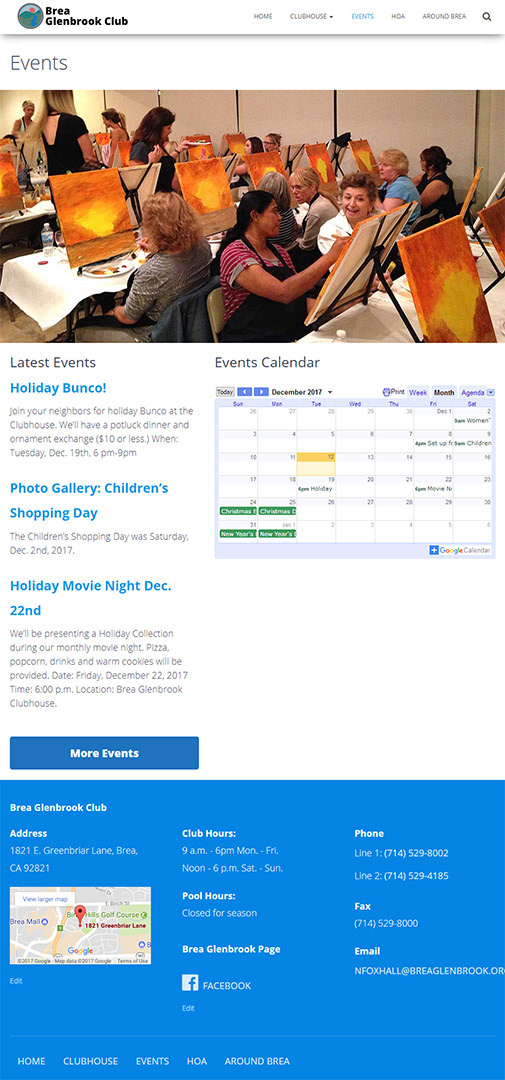
Events
Homeowners Association (HOA)
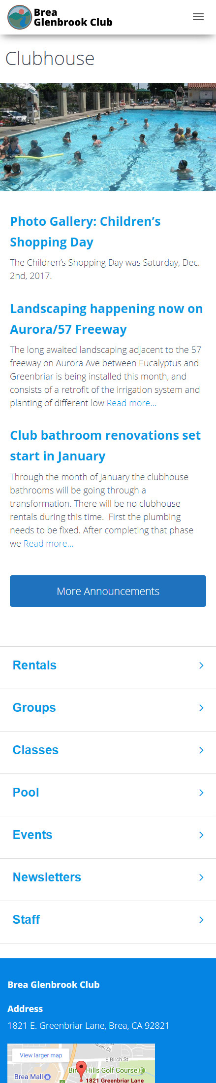
Clubhouse
Around Brea
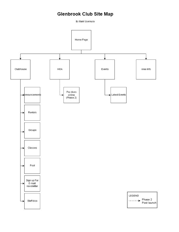
Site Map
The results of the card sort were turned into a site map. After visualizing how each piece of information was to be presented, the top-level category and subcategory pages were mapped.
A few phase two pages are also represented on this map.
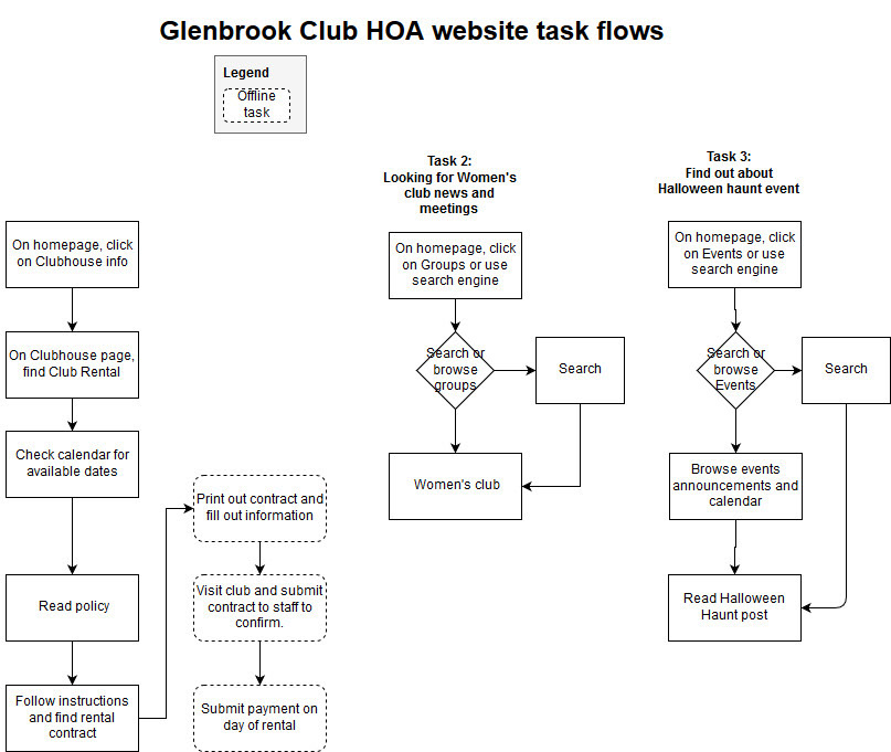
Task Flows
Each persona’s task (Gregory, Sally and Cynthia,) was run through a flow. I refined the flows to minimize the amount of steps the accomplish the tasks. This clarified what needed to be present in pages during the sketching and wireframing process.
Sketching
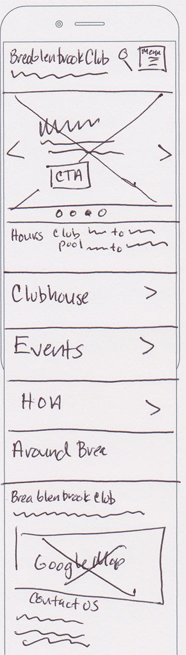
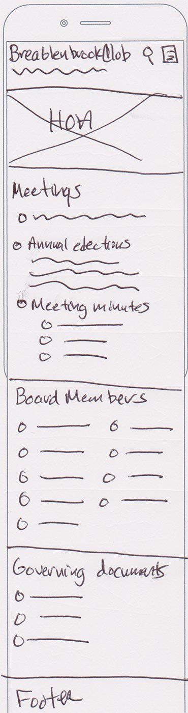
I started with different ideas, it was time to start sketching wireframes with pen and paper.
This process went through three iterations, organizing information and navigation in different ways. The stakeholder and I decided to proceed with a responsive website to deliver the same information to desktop and mobile users.
I sketched out a mobile site first, as this kept me disciplined with what was important, and what absolutely needed to be on the screens, and in what order from top to bottom.

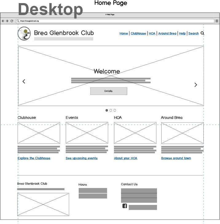
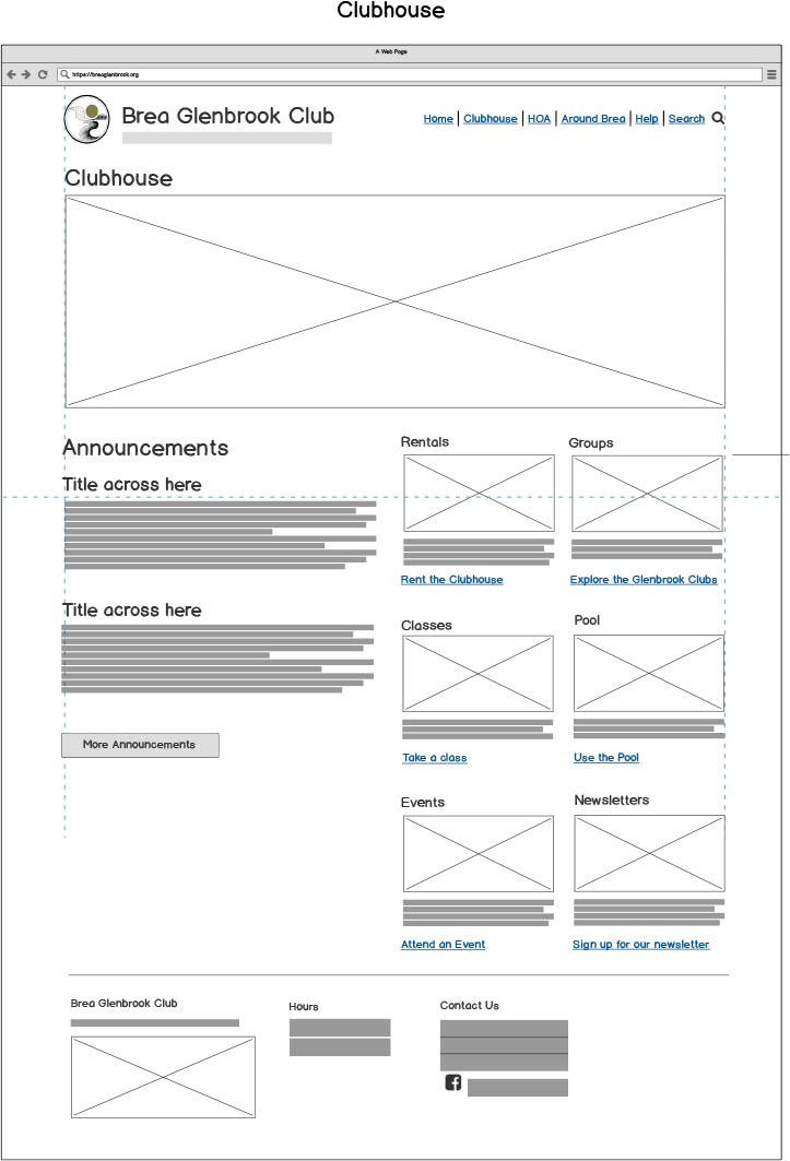
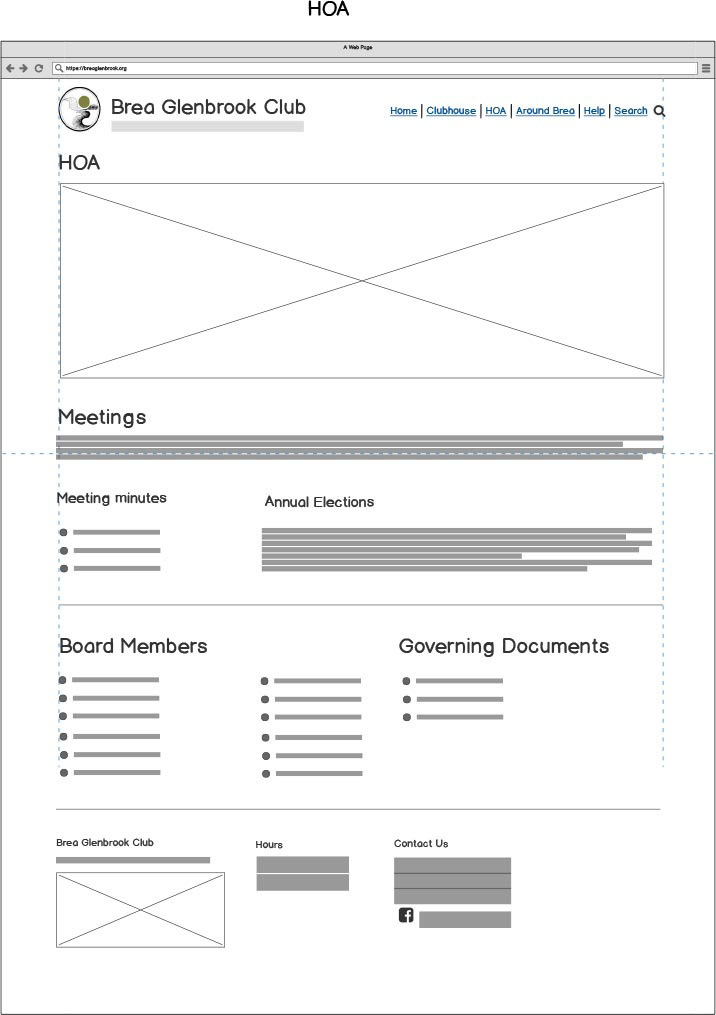
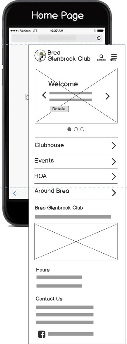
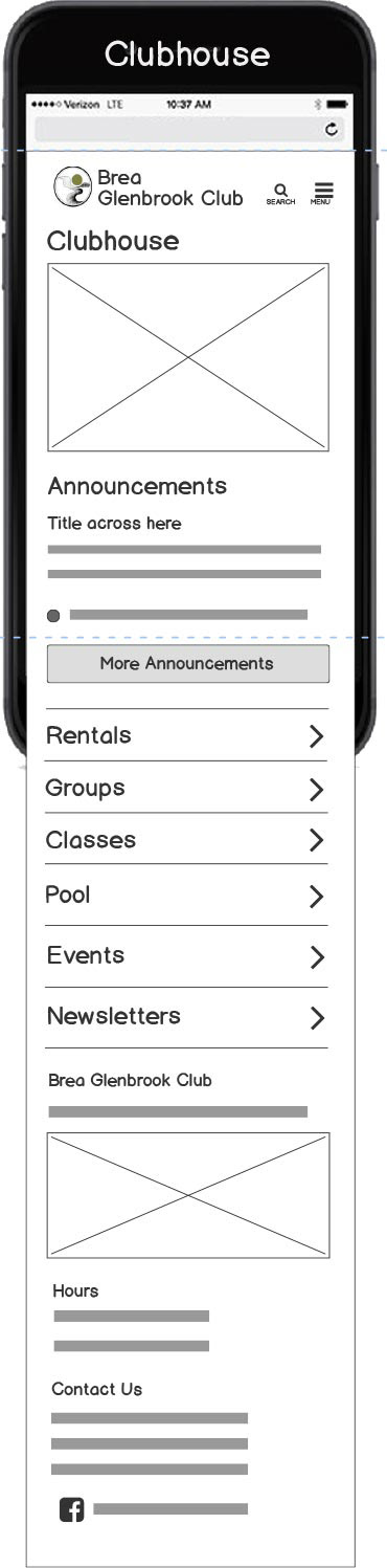
Wireframes
I created 29 responsive screens of the home page, section and subsection pages, the post page, menu and search pages. This went through seven iterations across a week, with feedback from the stakeholder. I used Balsamiq Cloud, which allowed quick changes and turnaround to the stakeholder.

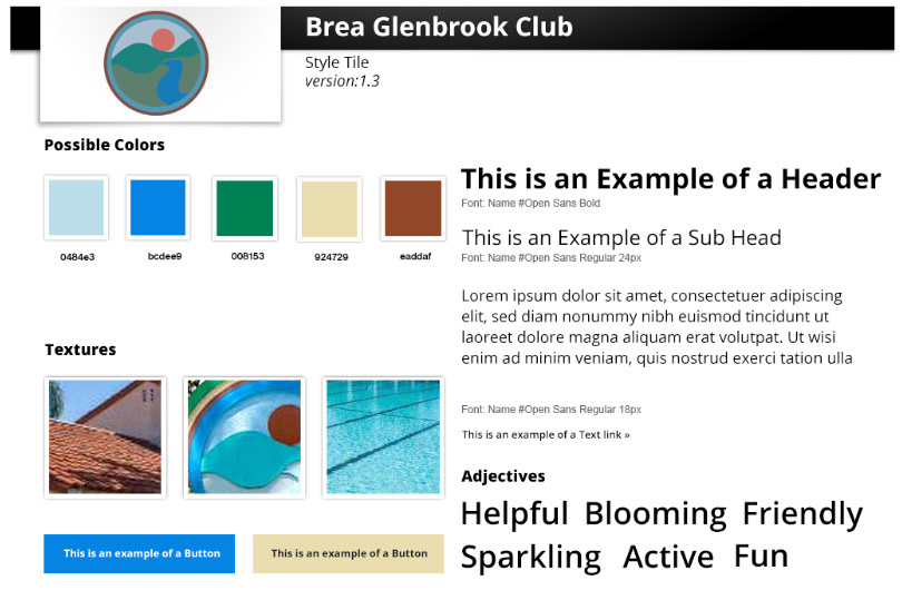
Styles and Colors
Colors were inspired by the colors at the Clubhouse (pool, tile roof, stucco, and Club logo.) The font, Open Sans, was decided on to convey a modern feel for the site, keeping readability in mind.
High-Resolution Screens in Sketch
Once the design progressed to our satisfaction, higher resolution screens were created in Sketch. Styles, fonts and color were applied. Content was created and placed to simulate the real website.
Prototype
Once the screens were finished in Sketch, they were imported into InVision via Craft.
Interaction and links were inserted on each screen, and a final prototype was created to simulated the finished website.
Usability Testing
I ran the same usability test (in person) users to root out any last minute problems before implementation and coding began on the real website. The prototype went through three iterations with changes suggested by the test users and the stakeholder.
Catching any problems here would prevent costly and time consuming reworking later. I chose three users that represented the three persona groupings, and were given the same tasks.
I facilitated the test and recorded any problems to correct in the future iteration.
Tasks, problems and solutions
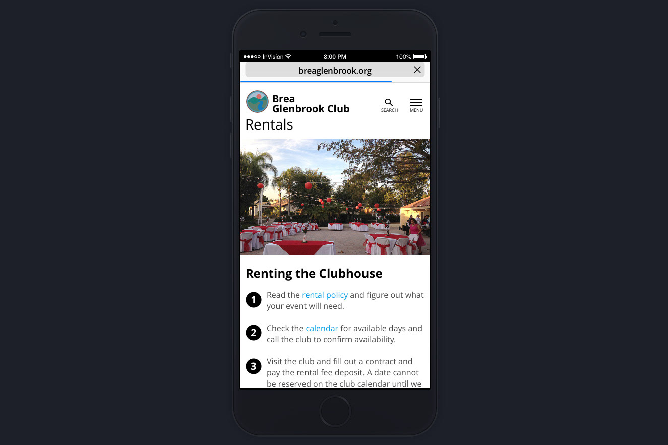
Find out how to rent the Clubhouse for your private event.
Problem observed: One users went to Events section to look for Rentals, instead of Clubhouse.
Solution observed: Added link to Rentals in Events section as well as Clubhouse section.
Find HOA meeting minutes for October 2017.
Problem observed: PDF of HOA meeting minutes popped into same browser tab when clicked on, which confused one user when trying to get out of the PDF view.
Solution: Have it either embedded in page or spawn new tab, or display PDF in a lightbox.
Search the site for something you’re looking for.
Problem observed: Some users couldn’t find the search function, where looking for it on body or footer.
Solution: Since this function is hidden in the hamburger menu, I added the search icon next to the hamburger menu on mobile view, and as a permanent link on desktop navigation.
Find the club hours for Saturday.
Problem observed: All users found the club hours on footer, as the same footer anchors all pages.
Solution: Consider putting club and pool hours on Clubhouse body.
Content Audit
After the basic design was approved, I started a content audit spreadsheet to inventory all of the needed content for each screen.
This was done early on to give the club staff time to generate the text, find appropriate images and populate the numerous calendars.
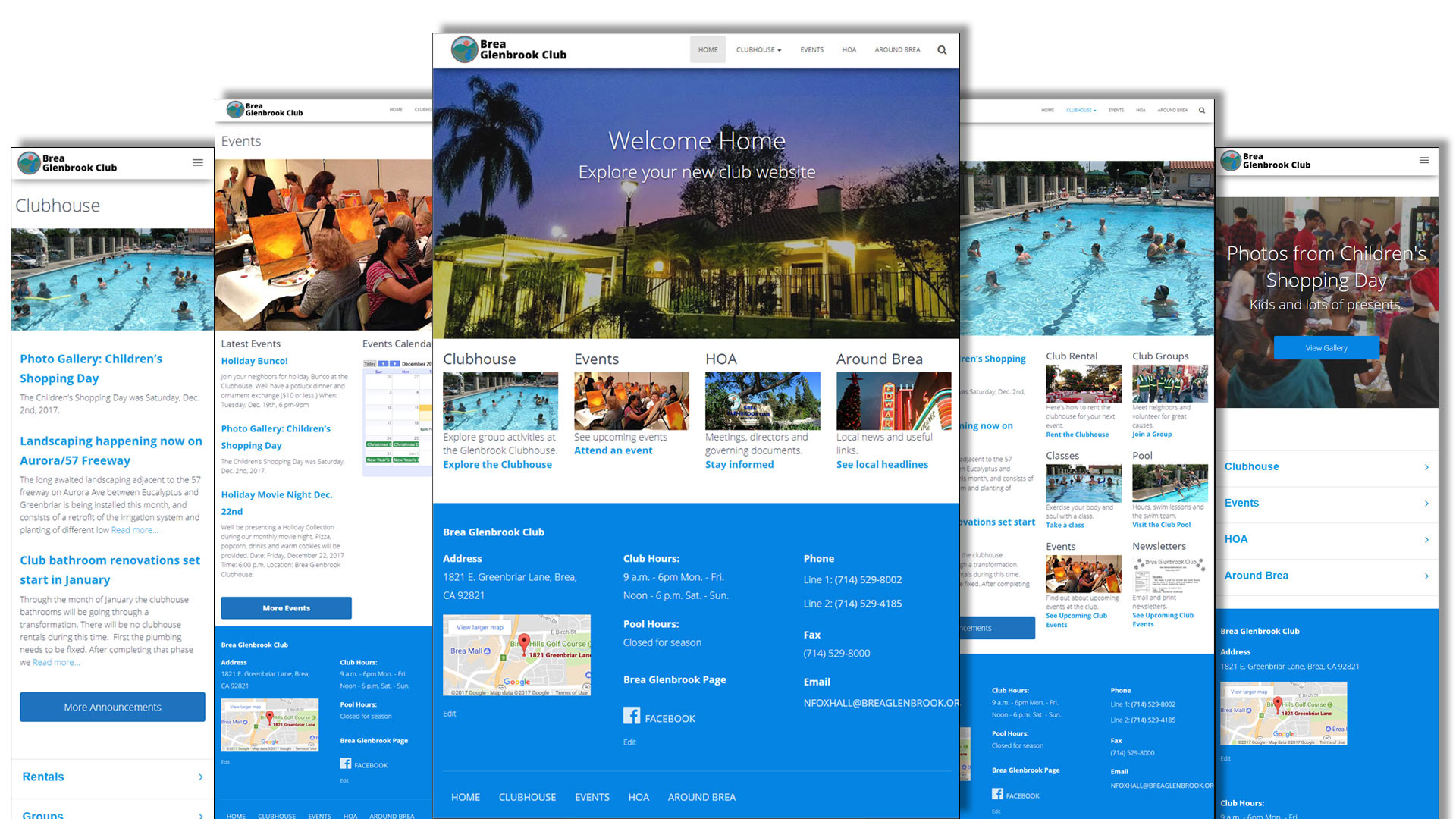
Implementation
Once the design and UI were set, I assigned the content deliverables to staff at the Club, following the content audit spreadsheet on Google Docs to keep track of each piece of content.
I recreated the Club logo in Adobe Illustrator because there it didn’t exist in a vector format.
I implemented the website on a hosted Linux WordPress system, and other vendor tools were set up and integrated (Google Analytics and Calendars, and Mail Chimp.)
I started with a base responsive theme template, and heavily modified the design to match my prototype. I built each page, modifying page presentation and underlying CSS as needed.
It took seven days to set up the site in WordPress, and one day of QA testing. I implemented a DNS change and the website went live two hours later.